
Pandas (4) - 그래프 그리기
그래프 그리기
데이터 시각화가 필요한 이유
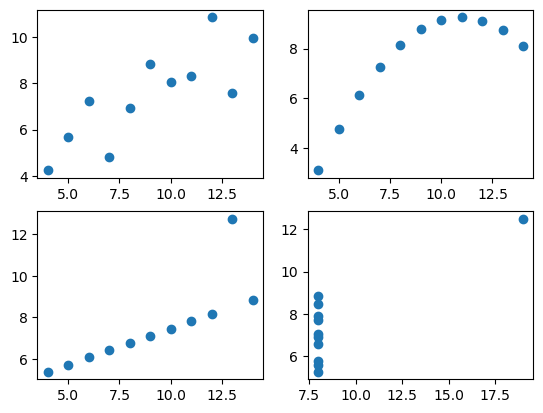
- 앤스콤 4분할 그래프
4개의 데이터 그룹은 데이터는 다르나 평균, 분산 같은 수칫값이나 상관관계 회귀선이 같다. 수치상 결과로는 구분이 안가지만 시각화를 통해 구분이 가능하다.
In [1]:
# seaborn 에서 자료 불러오기
import seaborn as sns
In [2]:
df = sns.load_dataset('anscombe')
df.head(2)
Out [2]:
| dataset | x | y | |
|---|---|---|---|
| 0 | I | 10.0 | 8.04 |
| 1 | I | 8.0 | 6.95 |
In [3]:
type(df)
Out [3]:
pandas.core.frame.DataFrame
In [4]:
# dataset 분리를 위해 값 확인
df['dataset'].unique()
Out [4]:
array(['I', 'II', 'III', 'IV'], dtype=object)
In [5]:
dataset1 = df[df['dataset'] == 'I']
dataset1
Out [5]:
| dataset | x | y | |
|---|---|---|---|
| 0 | I | 10.0 | 8.04 |
| 1 | I | 8.0 | 6.95 |
| 2 | I | 13.0 | 7.58 |
| 3 | I | 9.0 | 8.81 |
| 4 | I | 11.0 | 8.33 |
| 5 | I | 14.0 | 9.96 |
| 6 | I | 6.0 | 7.24 |
| 7 | I | 4.0 | 4.26 |
| 8 | I | 12.0 | 10.84 |
| 9 | I | 7.0 | 4.82 |
| 10 | I | 5.0 | 5.68 |
In [6]:
dataset2 = df[df['dataset'] == 'II']
dataset3 = df[df['dataset'] == 'III']
dataset4 = df[df['dataset'] == 'IV']
In [7]:
# 그래프 그리기
import matplotlib.pyplot as plt
In [8]:
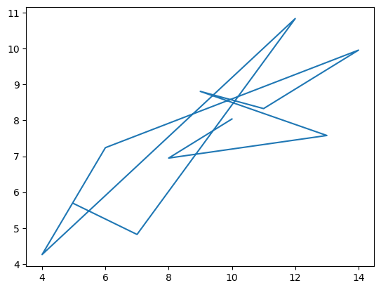
plt.plot(dataset1['x'], dataset1['y']) # 기본 선그래프
Out [8]:
[<matplotlib.lines.Line2D at 0x26de7477f70>]
In [9]:
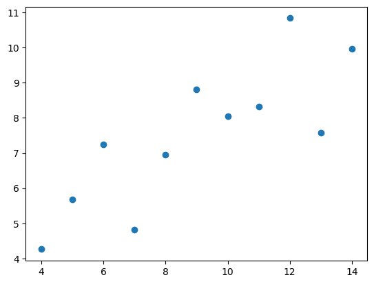
plt.plot(dataset1['x'], dataset1['y'], 'o') # 산점도
Out [9]:
[<matplotlib.lines.Line2D at 0x26de7b704c0>]
In [10]:
# 4개의 데이터 한번에 그리기
# 전체 기본틀(figure) 생성
fig = plt.figure()

# subplot 추가
a1 = fig.add_subplot(2, 2, 1)
a2 = fig.add_subplot(2, 2, 2)
a3 = fig.add_subplot(2, 2, 3)
a4 = fig.add_subplot(2, 2, 4)

# subplot에 데이터 추가
a1.plot(dataset1['x'], dataset1['y'], 'o')
a2.plot(dataset2['x'], dataset2['y'], 'o')
a3.plot(dataset3['x'], dataset3['y'], 'o')
a4.plot(dataset4['x'], dataset4['y'], 'o')
Out [10]:
[<matplotlib.lines.Line2D at 0x26de7c96c10>]
In [11]:
print(dataset1.mean(numeric_only=True))
print(dataset2.mean(numeric_only=True))
print(dataset3.mean(numeric_only=True))
print(dataset4.mean(numeric_only=True))
Out [11]:
x    9.000000
y    7.500909
dtype: float64
x    9.000000
y    7.500909
dtype: float64
x    9.0
y    7.5
dtype: float64
x    9.000000
y    7.500909
dtype: float64
In [12]:
print(dataset1.std(numeric_only=True))
print(dataset2.std(numeric_only=True))
print(dataset3.std(numeric_only=True))
print(dataset4.std(numeric_only=True))
Out [12]:
x    3.316625
y    2.031568
dtype: float64
x    3.316625
y    2.031657
dtype: float64
x    3.316625
y    2.030424
dtype: float64
x    3.316625
y    2.030579
dtype: float64
In [13]:
print(dataset1.corr())
print(dataset2.corr())
print(dataset3.corr())
print(dataset4.corr())
Out [13]:
          x         y
x  1.000000  0.816421
y  0.816421  1.000000
          x         y
x  1.000000  0.816237
y  0.816237  1.000000
          x         y
x  1.000000  0.816287
y  0.816287  1.000000
          x         y
x  1.000000  0.816521
y  0.816521  1.000000
matplotlib 라이브러리 자유자재로 사용하기
In [14]:
tips = sns.load_dataset('tips')
tips.head(2)
Out [14]:
| total_bill | tip | sex | smoker | day | time | size | |
|---|---|---|---|---|---|---|---|
| 0 | 16.99 | 1.01 | Female | No | Sun | Dinner | 2 |
| 1 | 10.34 | 1.66 | Male | No | Sun | Dinner | 3 |
In [15]:
print('type : {}'.format(type(tips)))
print('shape : {}'.format(tips.shape))
Out [15]:
type : <class 'pandas.core.frame.DataFrame'>
shape : (244, 7)
In [16]:
tips.info()
Out [16]:
<class 'pandas.core.frame.DataFrame'>
RangeIndex: 244 entries, 0 to 243
Data columns (total 7 columns):
 #   Column      Non-Null Count  Dtype
---  ------      --------------  -----
 0   total_bill  244 non-null    float64
 1   tip         244 non-null    float64
 2   sex         244 non-null    category
 3   smoker      244 non-null    category
 4   day         244 non-null    category
 5   time        244 non-null    category
 6   size        244 non-null    int64
dtypes: category(4), float64(2), int64(1)
memory usage: 7.4 KB
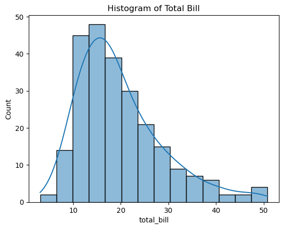
히스토그램
일변량 그래프(변수 하나 필요), 데이터는 연속적인 값
값의 범위를 10개(default)로 나눠 구간에 해당하는 값(시작값~끝앞값)을 count해준다
In [17]:
fig = plt.figure()
a1 = fig.add_subplot(1, 1, 1)

# 히스토그램 그리기
a1.hist(tips['total_bill']) # bins : 값을 몇개 나누는지(default 10)

# 제목 설정
a1.set_title('Histogram of Total Bill')

# x축, y축 레이블
a1.set_xlabel('Frequency')
a1.set_ylabel('Total Bill')
Out [17]:
Text(0, 0.5, 'Total Bill')
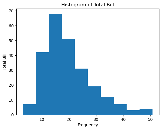
3.07에서 7.844앞까지 7건…
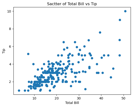
산점도
이변량 그래프(변수가 2개 필요), 점으로 데이터 표시, 두 변수 사이의 관계를 볼 수 있다
In [18]:
fig1 = plt.figure()
a1 = fig1.add_subplot(1, 1, 1)

# 산점도 그리기
a1.scatter(tips['total_bill'], tips['tip']) # 변수 2개 필요

# 제목 설정
a1.set_title('Sactter of Total Bill vs Tip')

# x축, y축 레이블
a1.set_xlabel('Total BIll')
a1.set_ylabel('Tip')
Out [18]:
Text(0, 0.5, 'Tip')
박스플롯
이산형 변수([남, 여]처럼 명확하게 구분되는 값)와 연속형 변수를 함께 사용
데이터의 분포와 이상치를 동시에 보여주면서 서로 다른 데이터군을 쉽게 비교할 수 있는 데이터 시각화 유형
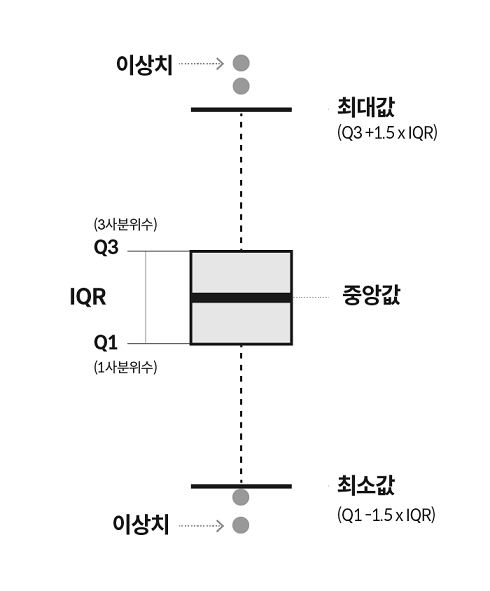
사분위수(Q1: 1사분위수;25%, 2사분위수;50%;중앙값, Q3: 3사분위수;75%)
\(Q3 - Q1 = IQR\)
최댓값 : Q3 + 1.5 * IQR
최솟값 : Q1 - 1.5 * IQR
데이터가 있으면 해당 지점을, 없으면 중앙값 쪽으로 값을 당겨 지점을 정하고 그 지점을 최댓값, 최솟값이라 한다.
이 범위를 넘어가는 값을 이상치라 한다.
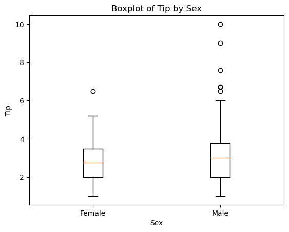
In [19]:
fig2 = plt.figure()
a1 = fig2.add_subplot(1, 1, 1)

# 박스플롯 그리기
a1.boxplot([tips[tips['sex'] == 'Female']['tip'],
            tips[tips['sex'] == 'Male']['tip']],
          labels=['Female', 'Male']) # 변수 1개를 list로

# 제목 설정
a1.set_title('Boxplot of Tip by Sex')

# x축, y축 레이블
a1.set_xlabel('Sex')
a1.set_ylabel('Tip')
Out [19]:
Text(0, 0.5, 'Tip')
다변량 그래프 - 산점도
In [20]:
# 색상지정에 문자열지정이 안되므로 숫자로 변환
def recode_sex(sex):
    if sex == 'Female':
        return 0
    else:
        return 1
In [21]:
# 데이터프레임에 함수 일괄적용
tips['sex_color'] = tips['sex'].apply(recode_sex)
In [22]:
tips.head()
Out [22]:
| total_bill | tip | sex | smoker | day | time | size | sex_color | |
|---|---|---|---|---|---|---|---|---|
| 0 | 16.99 | 1.01 | Female | No | Sun | Dinner | 2 | 0 |
| 1 | 10.34 | 1.66 | Male | No | Sun | Dinner | 3 | 1 |
| 2 | 21.01 | 3.50 | Male | No | Sun | Dinner | 3 | 1 |
| 3 | 23.68 | 3.31 | Male | No | Sun | Dinner | 2 | 1 |
| 4 | 24.59 | 3.61 | Female | No | Sun | Dinner | 4 | 0 |
In [23]:
fig3 = plt.figure()
a1 = fig3.add_subplot(1, 1, 1)

# 산점도 그리기 # s: size;수에 따라 점의 크기가 달라짐, c: color, alpha: 투명도
a1.scatter(tips['total_bill'], tips['tip'],
           s=tips['size']*10, c=tips['sex_color'], alpha=0.5, cmap='Accent')

# 제목 설정
a1.set_title('Sactter of Total Bill vs Tip')

# x축, y축 레이블
a1.set_xlabel('Total Bill')
a1.set_ylabel('Tip')
Out [23]:
Text(0, 0.5, 'Tip')
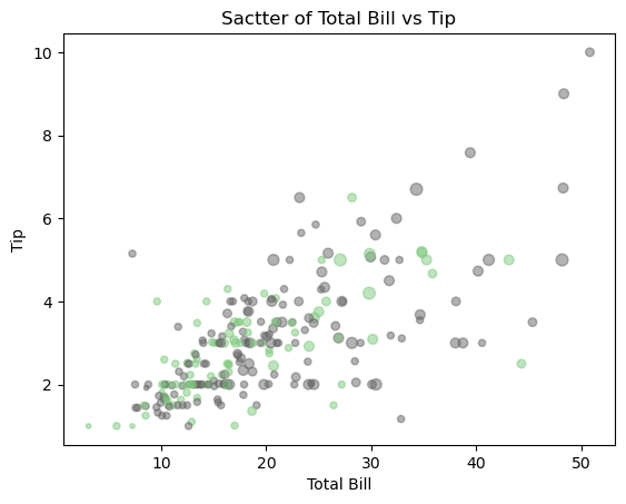
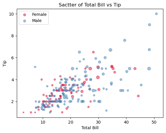
In [24]:
fig3 = plt.figure()
a1 = fig3.add_subplot(1, 1, 1)
data = {'Female':tips[tips['sex']=='Female'],
       'Male':tips[tips['sex']=='Male']}
labels = ['Female', 'Male']
colors = ['crimson', 'steelblue']

# 위 그래프와는 다르게 data를 2개로 나눠서 그림 => legend를 표시
for i, label in enumerate(labels):
    X = data[label]['total_bill']
    Y = data[label]['tip']
    a1.scatter(X, Y, s=data[label]['size']*10, c=colors[i], alpha=0.5, label=label)

# 제목 설정
a1.set_title('Sactter of Total Bill vs Tip')

# x축, y축 레이블
a1.set_xlabel('Total Bill')
a1.set_ylabel('Tip')
a1.legend(loc='best')
Out [24]:
<matplotlib.legend.Legend at 0x26de7fead00>
seaborn 라이브러리 자유자재로 사용하기
히스토그램
In [25]:
ax = plt.subplots()
ax = sns.histplot(tips['total_bill']) # matplotlib기반, title과 label 작성하려면 plt와 사용
ax.set_title('Histogram of Total Bill')
Out [25]:
Text(0.5, 1.0, 'Histogram of Total Bill')

In [26]:
ax = sns.histplot(tips['total_bill'], kde=True)
ax.set_title('Histogram of Total Bill')
# 밀집도 그래프: 면적이 1이 되도록 만든 그래프
Out [26]:
Text(0.5, 1.0, 'Histogram of Total Bill')

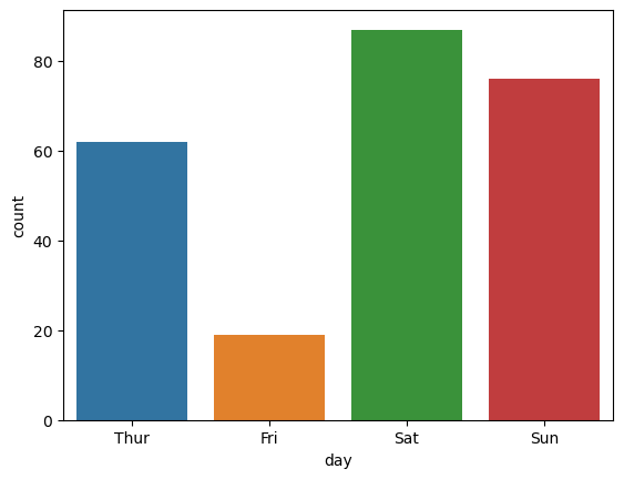
카운트플롯
연속값이 아닌 이산값을 나타낸다
In [27]:
ax = sns.histplot(data=tips, x='total_bill', kde=True) # data와 x를 이용한 방법
ax.set_title('Histogram of Total Bill')
Out [27]:
Text(0.5, 1.0, 'Histogram of Total Bill')
In [28]:
sns.countplot(data=tips, x='day')
Out [28]:
<AxesSubplot:xlabel='day', ylabel='count'>
In [29]:
tips['day'].unique()
Out [29]:
['Sun', 'Sat', 'Thur', 'Fri']
Categories (4, object): ['Thur', 'Fri', 'Sat', 'Sun']
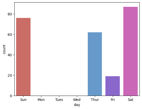
In [30]:
day_list = ['Sun', 'Mon', 'Tues', 'Wed', 'Thur', 'Fri', 'Sat']
In [31]:
sns.countplot(data=tips, x='day', order=day_list, palette="hls") # order: 문자열의 배열로 순서를 지정
Out [31]:
<AxesSubplot:xlabel='day', ylabel='count'>
Reference
- 이 포스트는 SeSAC 인공지능 자연어처리, 컴퓨터비전 기술을 활용한 응용 SW 개발자 양성 과정 - 심선조 강사님의 강의를 정리한 내용입니다.
- python.org : datetime Document
- 데이터시각화의모든것 : 데이터 시각화를 활용해야 하는 5가지 이유와 방법!
- Autodesk : Same Stats, Different Graphs
- AI OnBook : 박스플롯
- mathcom : 파이썬 그래프 matplotlib - scatter
댓글남기기